
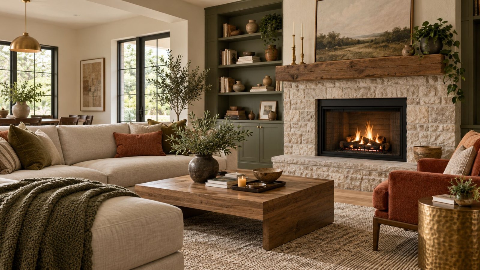

Most color advice starts with inspiration: a photo, a mood board, a favorite hue. That is a reasonable place to start feeling excited about a room, but it is the wrong place to start deciding, because it skips the one thing you cannot change after the fact: what is already fixed in the room.
This guide to interior color ideas walks through Wallsaide’s process for building a palette that works in your space, not just in a photo.
The interior color ideas in this guide are designed to help you move from inspiration to a palette that responds to your room’s existing materials, lighting, and furnishings.
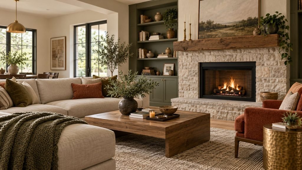
What actually makes a color palette work
A palette works when three things line up: the colors relate to each other in a clear way, they suit the fixed things in the room you cannot change, and they still look intentional under the room’s real lighting, not just under showroom lighting or a phone screen’s color rendering.
Most palettes that feel off fail at one of these three points, not because the individual colors were necessarily poor choices on their own.
Hue, value, and saturation: the vocabulary worth knowing
Three simple terms explain why two rooms that technically use the same color can feel completely different:
Hue is the basic color family: blue, green, terracotta, and so on.
Value is how light or dark that hue is. A pale sage and a deep forest green share a hue but sit at very different values.
Saturation is how intense or muted a hue is. A vivid emerald and a dusty, grayed-down sage can share a similar hue yet read completely differently because of saturation.
This matters practically. Two rooms can share a hue, green for example, and still feel unrelated because one is high-value and low-saturation, such as a pale dusty sage, while the other is low-value and highly saturated, such as a deep emerald.
When colors seem compatible by hue but still feel disconnected, differences in value and saturation are worth checking alongside undertones, materials, and lighting.
This also explains the four directions below. Warm and cool describe color temperature relationships, while muted and high-contrast describe different aspects of saturation and value. They are separate dimensions of a palette rather than competing approaches.
Contrast, in practical terms, is the value difference between elements in a room. A low-contrast room with similar values throughout can read as quieter and more cohesive, while a high-contrast room with light placed against dark appears more graphic and defined.
Neither approach is inherently better. Contrast tends to feel more intentional when it is distributed deliberately rather than appearing as a series of unrelated dark or light elements.
Interior color ideas: 4 palette directions to see in practice
These four examples are not formulas. Think of them as visual reference points that demonstrate how temperature, value, saturation, materials, and contrast can interact.
Warm and grounded
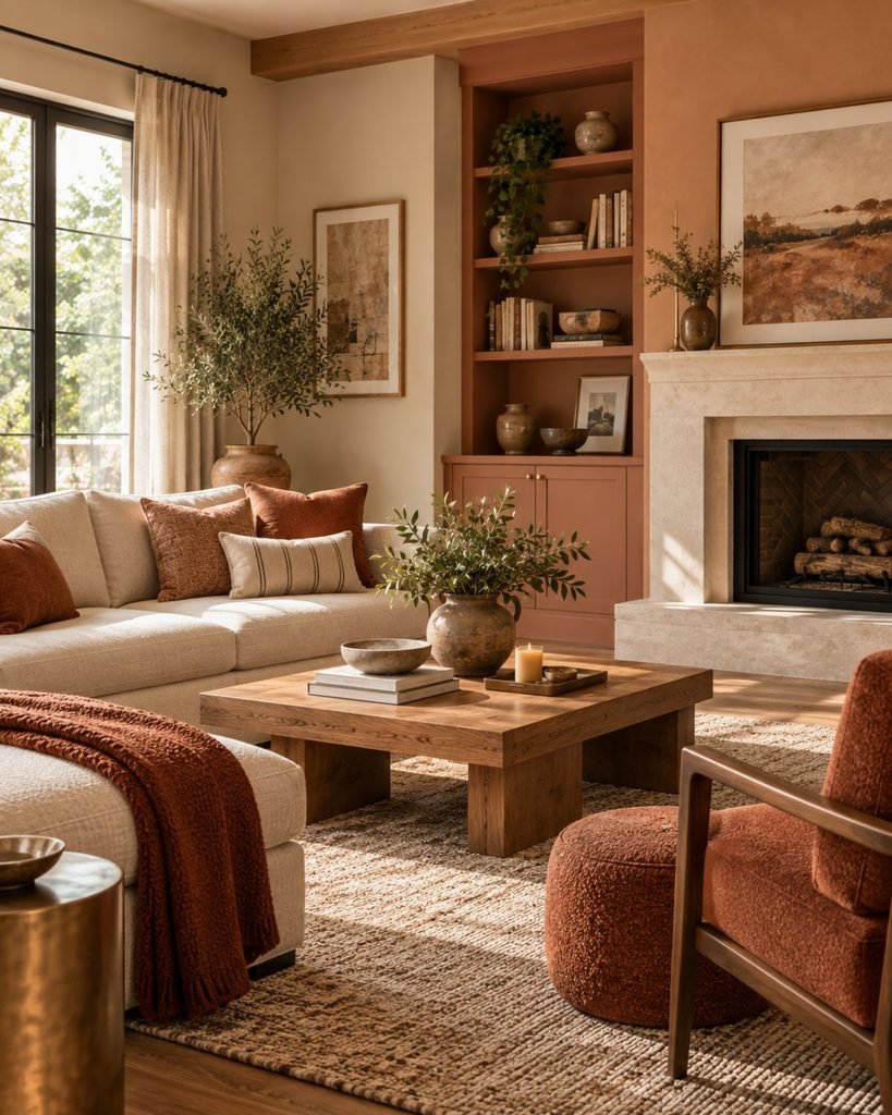
Terracotta, warm cream, honey-toned wood, and brass create a warm-dominant direction.
How rich or heavy the palette appears in a particular room depends on more than warmth alone. Value, saturation, surrounding materials, and lighting all influence the result. A muted mid-value terracotta, for example, behaves differently from a very dark or highly saturated version of the same hue.
In lower light, the specific value and saturation of a warm color matter as much as its temperature.
Cool and calm
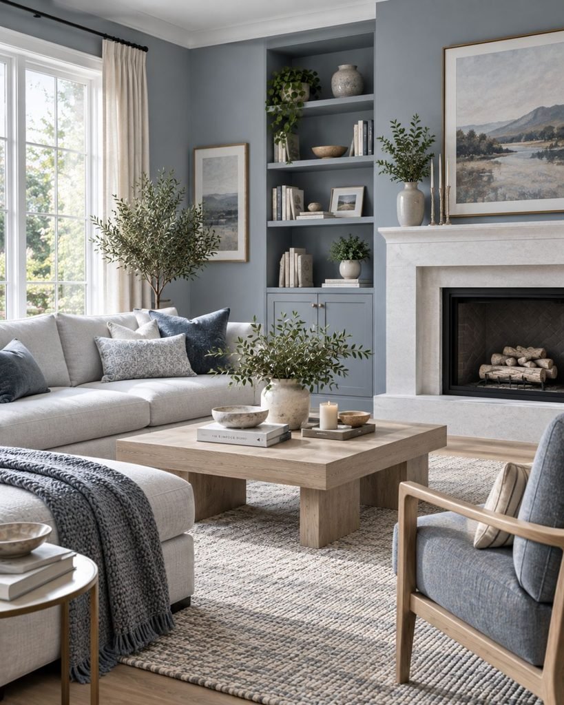
Blue-gray, white oak, brushed nickel, and cool white textiles create a distinctly cooler direction.
Whether it appears quiet, crisp, or stark depends on more than daylight alone. The room’s orientation, the value and saturation of the blue-gray, nearby wood and textile tones, and the color temperature of artificial lighting all contribute.
A high-value, softly saturated blue-gray alongside warmer wood can behave very differently from a darker, more saturated blue-gray surrounded by cool finishes.
A darker, more saturated cool tone under predominantly cool artificial lighting can create a substantially different effect, which is why testing in the actual room matters.
Muted and low-contrast
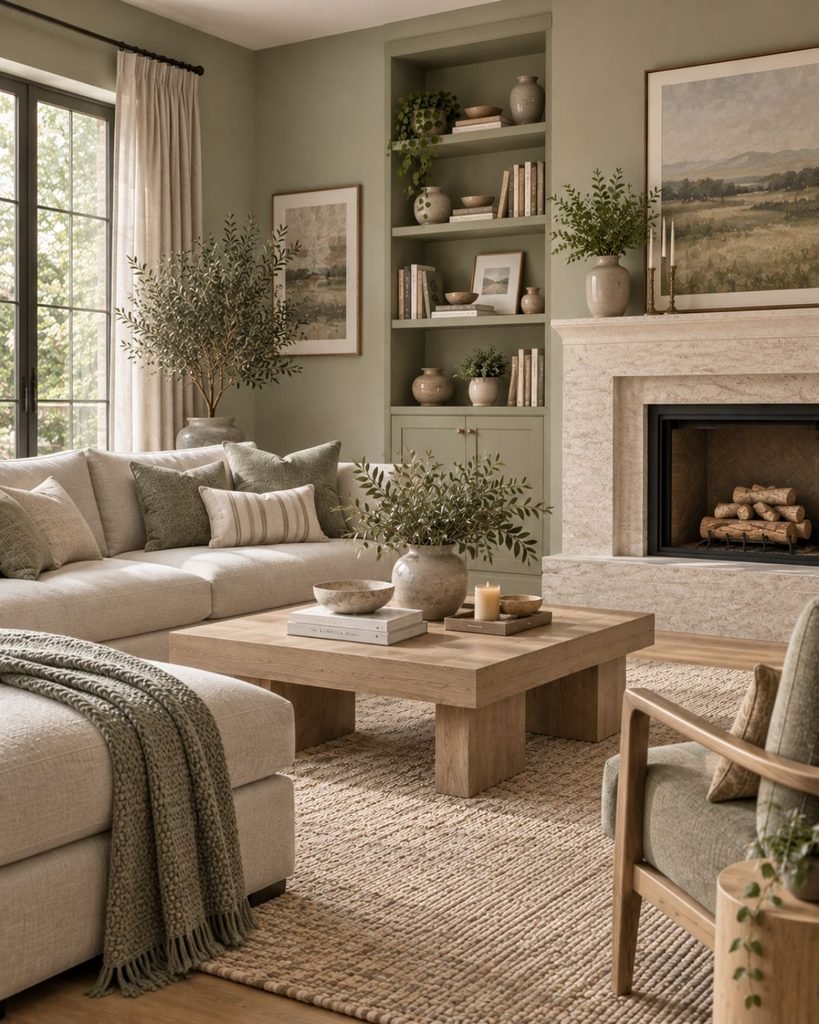
Dusty sage, putty, and pale oak can create a restrained palette when their values remain relatively close.
Because no single element creates a dramatic jump between light and dark, the overall composition appears visually quieter. A room built entirely from similar values, however, can become under-defined if there is no deliberate point of contrast.
That contrast does not have to come from another strong color. Darker hardware, artwork, a lamp, wood grain, or a slightly deeper textile may be enough to establish definition.
High-contrast
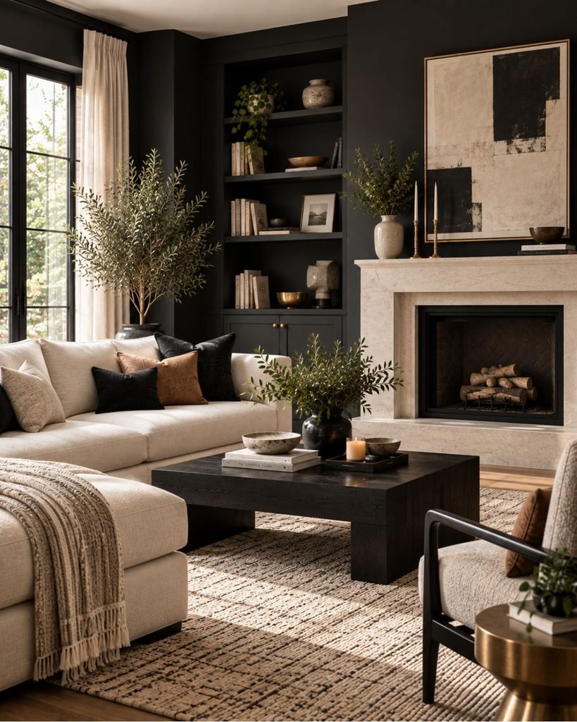
Charcoal, cream, black, and brass demonstrate the opposite approach, with clear separation between lighter and darker elements.
How heavy this direction feels is not simply a function of daylight. It also depends on how dark and light surfaces are distributed through the room.
A charcoal wall beside cream upholstery, pale trim, reflective surfaces, and lighter flooring creates a different balance from the same charcoal surrounded predominantly by other dark materials.
These four directions are starting points rather than fixed schemes. Wallsaide’s dedicated color and combination guides will explore individual colors and pairings in greater depth as the color library grows.
Rather than treating interior color ideas as isolated combinations, the next step is understanding how to build those colors around the materials already present in your room.
The Wallsaide palette-building method
Most color advice starts with inspiration and works backward toward a decision. The Wallsaide method starts with what is already fixed in the room and works forward, because those elements are the part an inspiration image cannot account for.
This is a Wallsaide editorial method, not an industry standard.
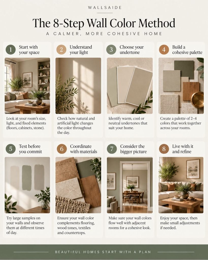
- Read the fixed elements first. Identify flooring, countertops, tile, stone, cabinetry, and other finishes you are not replacing.
- Identify undertones. Look at both the fixed elements and the paint, fabric, or finish candidates you are considering.
- Choose a foundation color. Establish the dominant neutral or background that works with those existing materials.
- Select the main color. Choose the color that will give the room much of its visual identity.
- Add supporting or accent colors. Use them in smaller doses to support rather than compete with the main palette.
- Coordinate wood tones and metals. Treat them as part of the palette rather than unrelated finishing details.
- Test under real light. Evaluate important colors in the room under its actual daylight and artificial lighting.
- Distribute the palette deliberately. Repeat important colors and materials where useful so the room feels connected rather than assembled from unrelated choices.
Foundation, main, and accent: what is the difference?
These roles are related, but they are not interchangeable.
The foundation is generally the visual background of the room. Walls and large neutral surfaces often perform this role.
The main color gives the room more of its identity. It might appear on upholstery, cabinetry, a substantial wall treatment, or another visually important element.
An accent color is used more selectively to create contrast, repetition, or emphasis.
Problems can arise when every color is treated as an accent. A strong sofa, vivid rug, contrasting wall, colorful curtains, and unrelated accessories may all work individually, yet compete once they occupy the same room.
The objective is not to follow a rigid number of colors. It is to give the important colors clear roles.
Reading fixed elements and undertones
A fixed element is anything you are not planning to replace, such as hardwood floors, stone countertops, existing tile, or built-in cabinetry.
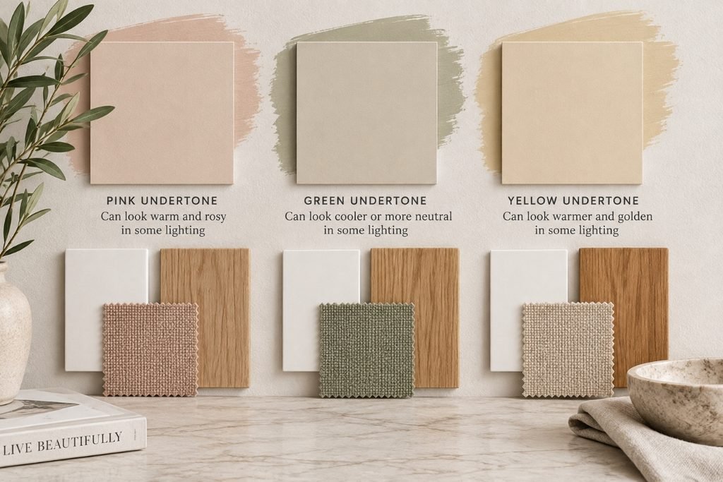
These materials can carry visible undertones even when they initially appear neutral. A wall color therefore needs to be evaluated beside the materials it will actually meet in the finished room.
Comparing a candidate color against a plain white surface can make relative undertones easier to notice. But white itself is not an absolute reference because whites can carry subtle undertones too.
Once you have narrowed the options, a more practical comparison is often the room itself.
Place the candidate beside the flooring, stone, tile, cabinetry, upholstery, or other fixed materials it needs to coexist with. The important question is not whether the color looks neutral on its own. It is how it behaves beside the surfaces that will remain in the room.
Wood tones, metals, and large textiles belong in the palette
Paint is only one source of color.
Wood furniture, flooring, metal finishes, sofas, rugs, curtains, stone, and other large surfaces can occupy substantial visual space. They therefore need to be considered as part of the same palette.
Two different woods can work together, but their relationship should be intentional. A honey-toned floor paired with a gray-washed table creates a different temperature relationship from the same floor paired with another warm wood.
The same principle applies to upholstery. A sofa is large enough to function almost like an architectural surface in the composition. Calling it “neutral” does not automatically mean its undertone will work with the wall, floor, and rug.
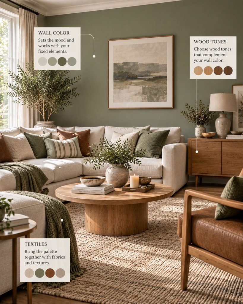
One practical starting point is to establish a dominant wood direction and a dominant metal direction within a sightline, then treat additional finishes as intentional contrasts rather than accidental additions.
That is a design heuristic, not a requirement. Mixed woods and mixed metals can work well when their relationships are deliberate.
Test color under the room’s real light
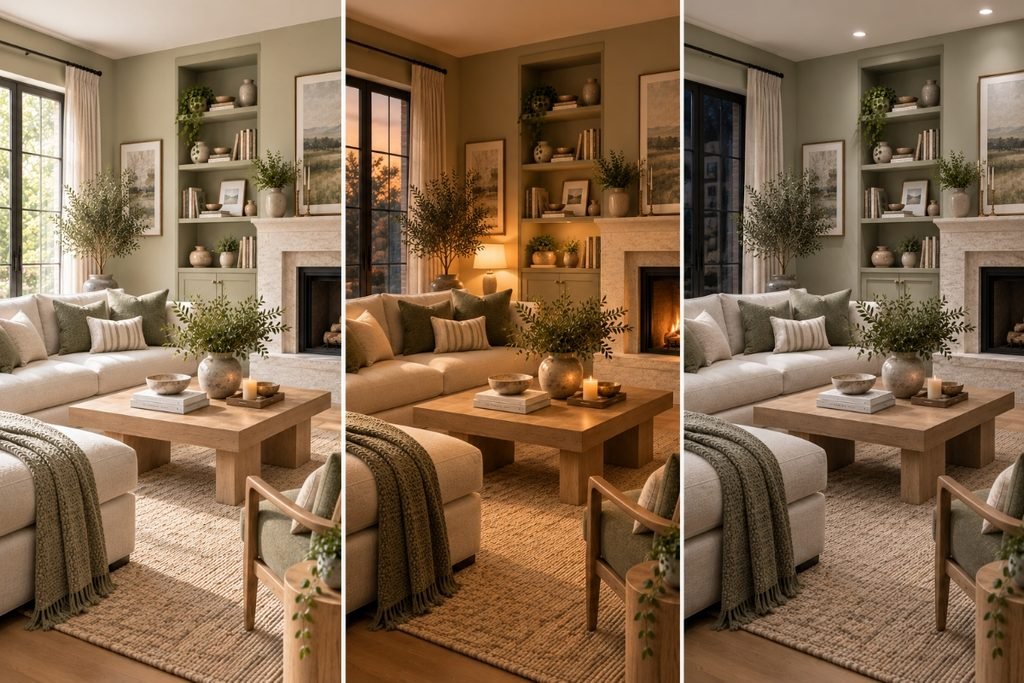
One common reason a chosen color looks different than expected once it reaches the wall is that it was evaluated under lighting unlike the conditions in the actual room.
Several variables can affect what you see.
Orientation changes the amount and character of daylight reaching an interior. The effect also varies with geography, season, time of day, window placement, and surrounding structures.
Weather can alter the intensity and character of daylight. An overcast day and direct sun will not present a surface identically.
Glazing and reflected surroundings matter too. Tinted glass, nearby buildings, vegetation, exterior surfaces, and interior reflections can influence the light reaching a wall.
Artificial lighting becomes increasingly important as daylight fades. A warm household lamp and a cooler artificial light source can render the same wall differently.
The practical response is not to find a paint color that never changes. Color appearance naturally shifts with its environment.
Instead, test the candidates in the actual room and decide whether the way they change remains compatible with the materials, furnishings, and lighting conditions you normally use.
Putting the method into practice: a warm oak floor and stone fireplace
Rather than treating interior color ideas as isolated combinations, the next step is understanding how to build those colors around the materials already present in your room.
A concrete example shows how the eight-step method can play out in practice.
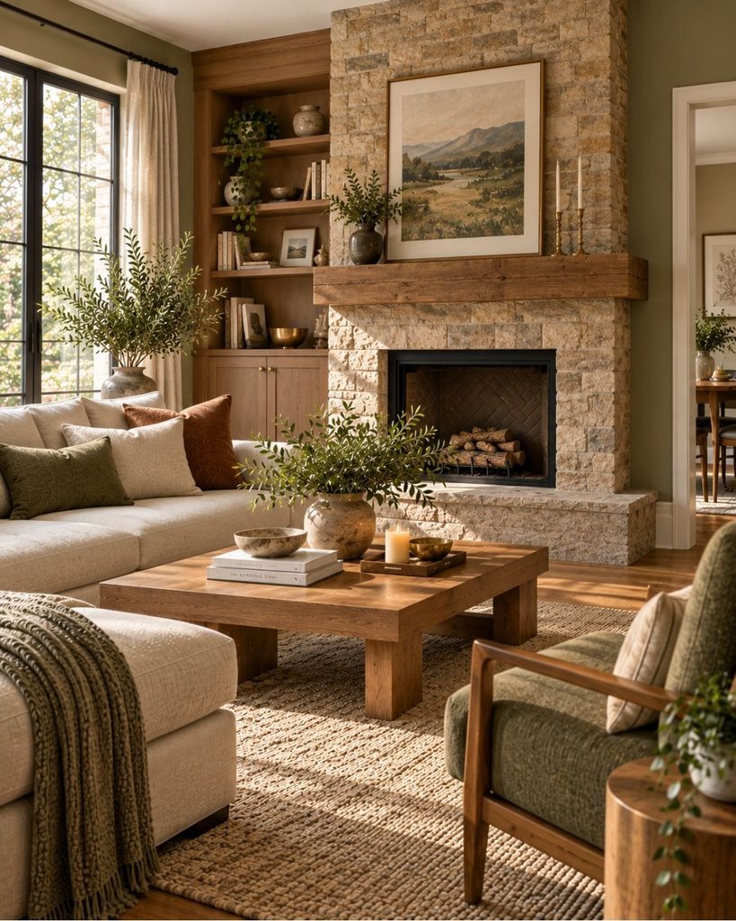
Imagine a living room with two major existing elements: a warm oak floor and a stone fireplace surround containing cream, gold, and rust-toned variation.
Read the fixed elements. The floor already contributes a substantial warm wood tone. The stone introduces cream plus warmer veining. These surfaces become the starting point rather than obstacles to work around later.
Identify the undertones. Comparing the floor and stone with potential finishes suggests testing warm or balanced neutrals first.
That does not automatically exclude cooler grays or blue-grays. A cooler choice would introduce a more deliberate warm-cool contrast and would therefore need to be evaluated carefully beside both materials.
Choose the foundation. A soft warm greige is tested for the walls. Its relatively light value helps offset the visual weight of the floor and fireplace, while its warmer direction relates to the existing materials.
Select the main color. A muted olive is introduced through the sofa. It gives the room a recognizable color beyond the neutral foundation without ignoring the warm materials already present.
Add a supporting accent. Rust-terra-cotta appears in smaller details, echoing some of the warmer variation already present in the fireplace stone.
Coordinate the other materials. A warm neutral rug, unbleached linen curtains, and additional wood close to the existing oak maintain the material story without requiring every surface to match.
Brass is selected because it reinforces the established warmth. Chrome or another cooler metal could also work, but it would introduce a more noticeable temperature contrast rather than continuing the warm material direction.
Test the combination. The greige, olive, textile, and material samples are viewed together under several lighting conditions.
Some change in appearance is expected. The question is whether the palette remains compatible with the oak, stone, upholstery, and other materials throughout the conditions in which the room is normally used.
Review the finished distribution. Warm greige forms the background, olive provides the main color, rust appears selectively, oak repeats through the room, and brass creates smaller points of material continuity.
Every major choice can now be traced back to the room itself rather than to an inspiration image from a completely different interior.
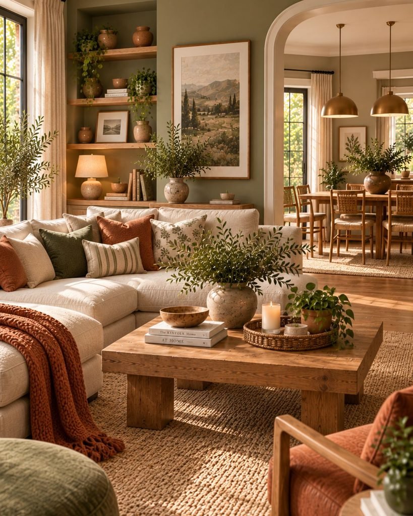
Distributing color through the room and between rooms
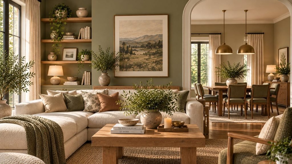
Distributing color through the room and between rooms.
If a rust accent appears on a cushion, for example, it might reappear more subtly in artwork, a rug detail, pottery, or another object elsewhere in the room.
This is not about symmetry or duplicating identical accessories. It is about creating visual relationships.
The same idea becomes more important between rooms that share sightlines.
An open-plan living and dining area does not need identical colors in both zones. A hallway visible from a bedroom does not need to repeat the bedroom palette exactly either.
Instead, continuity can come from related undertones, repeated woods, recurring metals, connected neutrals, or selective repetition of a color.
Where the 60/30/10 rule fits
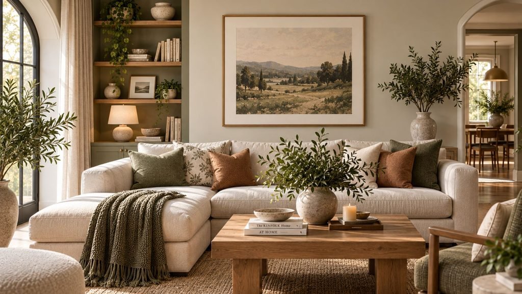
The 60/30/10 approach is a widely used decorating heuristic: roughly 60% dominant color, 30% secondary color, and 10% accent.
Its usefulness is primarily about proportion.
It does not tell you which colors belong together. It does not determine whether those colors suit your floor, stone, furniture, or lighting. Those decisions need to happen first.
It also does not need to be interpreted as a literal mathematical target. Architecture can make exact percentages impractical. A large fireplace, extensive cabinetry, an open window wall, or a substantial sofa can change the visual proportions of a room before decorating begins.
Use 60/30/10 as a rough balance check if it helps, not as a formula a successful room must satisfy.
Common color-selection mistakes
Even a strong palette direction can break down when the individual decisions are made in isolation. Common problems include:
Choosing from a small paint chip alone instead of evaluating a larger sample in the actual room.
Ignoring fixed finishes until after the wall color has been chosen.
Assuming every neutral has the same undertone.
Treating wood, metals, rugs, curtains, and upholstery as separate from the color scheme.
Adding unrelated colors to every available surface instead of establishing clear color roles.
Using contrast accidentally rather than deciding where light-dark differences should carry visual emphasis.
Judging paint under only one lighting condition.
Creating abrupt transitions between visually connected rooms without considering shared materials or sightlines.
Choosing your starting point
The best interior color ideas start with the room rather than the inspiration image. Rather than treating interior color ideas as isolated combinations, the next step is understanding how to build those colors around the materials already present in your room.
Identify the materials that are staying, study their undertones and relative values, establish a foundation, and then introduce the colors and finishes that will give the room its identity. Test the important choices together under the light the room actually receives.
Color is only one layer of the finished interior. Once your palette is established, use our complete living room design guide for living-room layout, furniture, lighting, rugs, and finishing decisions, or the complete bedroom design guide for applying the same broader thinking to a bedroom.
As Wallsaide’s color library grows, the individual color-pairing and combination guides will take these principles further for specific hues and palettes.
Interior color ideas FAQ
What is the 60/30/10 rule in interior design?
The 60/30/10 rule is a decorating heuristic suggesting roughly 60% dominant color, 30% secondary color, and 10% accent. It can help with visual proportion after the colors have been selected, but it does not determine which colors will work together and does not need to be followed mathematically.
How do you know if a paint color has a warm or cool undertone?
Comparing a color with a white reference can make relative undertones easier to notice, although whites themselves can have undertones. It is also useful to compare the candidate directly with the room’s flooring, stone, cabinetry, textiles, and other fixed materials because those are the relationships that matter in the finished room.
What is the difference between hue, value, and saturation?
Hue is the basic color family, such as blue or green. Value describes how light or dark the color is. Saturation describes how intense or muted it is. Colors from the same hue family can therefore produce very different interiors when their value or saturation changes.
Should every room in a house have the same color palette?
No. Connected rooms can use different colors while still sharing visual relationships through undertones, woods, metals, neutrals, or selected repeating colors. This is particularly useful when rooms are visible from one another.
How many paint colors should you test before choosing?
There is no fixed number. Test the candidates you are seriously considering on sufficiently large samples and observe them under the room’s different lighting conditions before making the final choice.
About the author
Lauren Johnson writes about interior design, room inspiration, and practical decorating for Wallsaide. Her work focuses on translating design ideas into approachable ways to improve everyday homes, with an emphasis on thoughtful layouts, cohesive styling, color, and comfortable living spaces.